
The Working Capitol Branding 2.0
Rebranding Project: Windows to Keong Saik
It was coming 5 years that the brand and website had been at the front-line as their purpose become obsolete and their aesthetic got tired; it was time for a review of their relevance and effectiveness. The Branding and Website Project was dubbed “TWC 2.0”. I was solely responsible for all Visuals, Concept, and Illustrations while the website (displayed at the end under "‘applications’) was a collaboration with Marketing Manager, Gobind Sandhu and Content Lead, Raun Anand, This Project, that lasted for 2 months, was an aggressive exercise for me; working with time and budget constraints. The result was the birth of TWC 2019: Windows to Keong Saik.
Problem
Before
Thin strokes and proportions make the logo graphically weak and feeble for increased applications on commercial applications; alongside bold and distinct logos of other companies.
Sterile and alienating
Does not reflect the quaint neighborhood and shop houses
Solution
After
Wordmark logo will make the TWC name prominent and eliminate the symbol-wordmark proportion problem.
Modular and versatile graphics
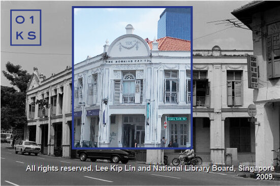
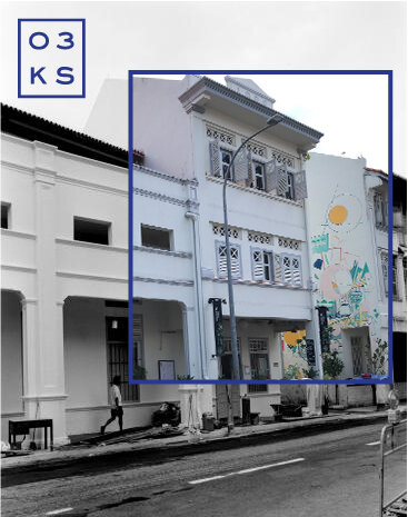
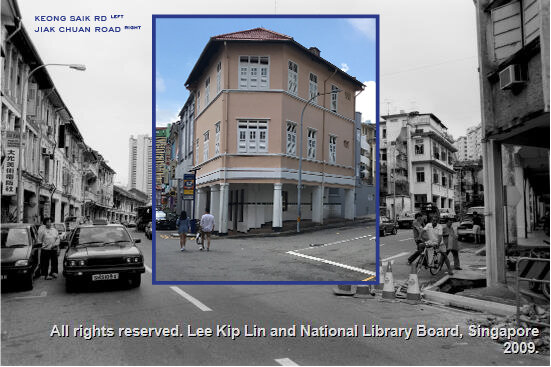
Shop house and neighborhood oriented
Applications
Sales Video I directed, shot, and edited, promoting Level 1 of our flagship former Tiger Balm building, 89 Neil Road. This was part of the reason we clinched Shake Shack as our client.
Deck Design Templates I created for all departments like Marketing, Sales, Business Development, and Operations.
During the Transformation of our feature building 89 Neil Road in the days leading up to Shake Shack’s Opening, I captured the transformation of the facade of the building.
89 Neil Road Shake Shack Transformation. Junction of Craig Road and Neil Road.
Shack Shake Mural Progress Transformation. Neil Road.
Brand Feature Animation. Used in Web, Social banners, and TV screens around the co-working space.
UI Web design for TWC main Products.
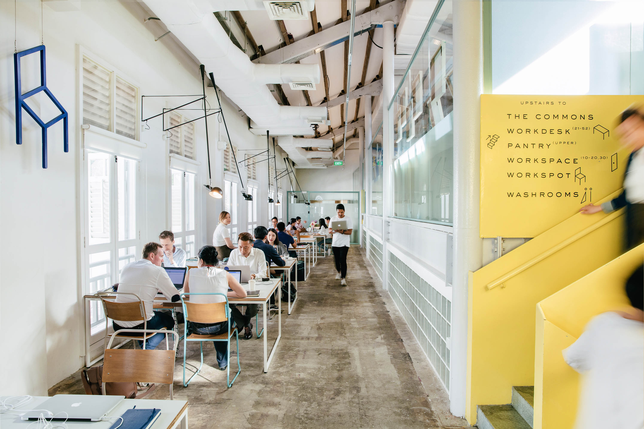
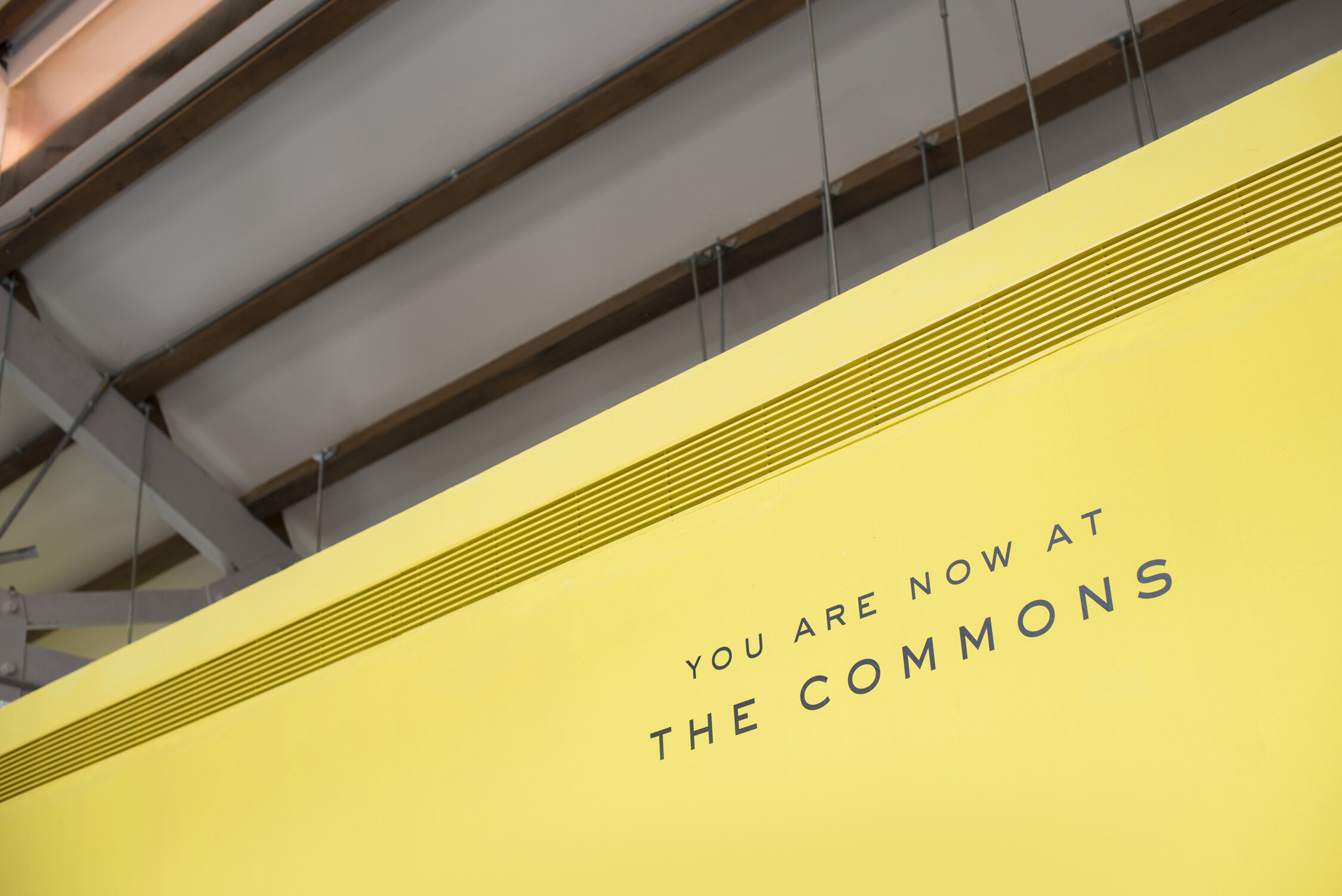
Building Logos & Wayfinding Signage







Illustrations


